I don’t understand why sources of data as rich as financial statements are not shown more often as charts. I believe visualizing them in other ways than just tables can be very insightful. I want to show here some possibilities for visualizing financial statements.
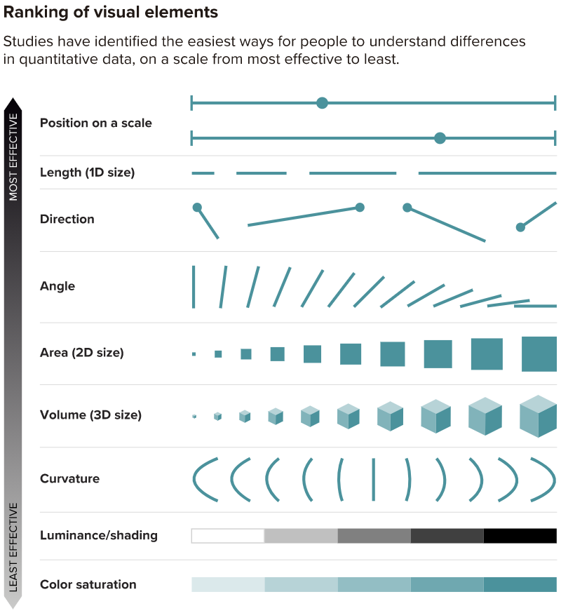
First of all, studies starting at 1984, with William S. Cleveland and Robert McGill, have demonstrated that certain dimensions are better perceived by humans than others; for example, length is better discerned than area. There is a nice ranking below showing these dimensions. I copied it from this article (it’s a good article by itself, go read it if you are interested):
With that in mind, we can start trying some visualizations with one of the financial statements.
The Mighty Balance Sheet
A balance sheet shows a company’s assets, liabilities and shareholders’ equity at a specific point in time. Some obvious visualizations would be a bar chart for comparing accounts’ values on a specific time point or a line graph to compare account’s values over time. I’d like to suggest two other possibilities.
Sankey Diagram
A sankey diagram is usually used to display flows from one set of values to another so that they show a many-to-many mapping between domains.
If you look at a balance sheet, you’ll see that accounts can be decomposed into sub-accounts. At the first level, the balance sheet can be divided as Assets, Liabilities and Equity. At the second level, Assets can be divided into Current Assets, Long-Term Assets and so on. If you consider that every level in the balance sheet is a set of values (accounts), you can show how the accounts are sub-divided into sub-accounts and its relation to the total value. Well, it’s better to show it:
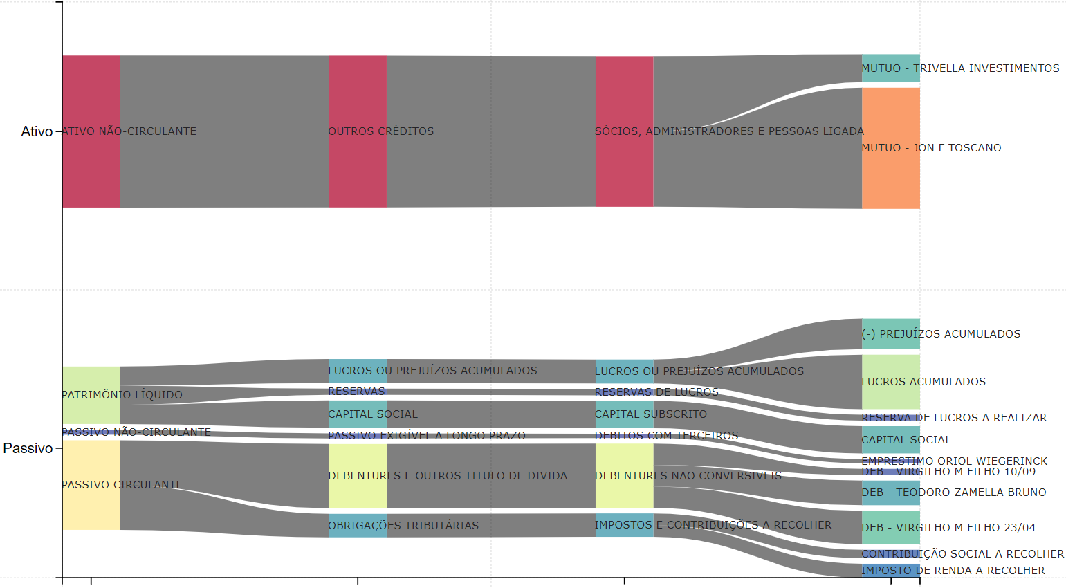
The chart is showing a balance sheet in Portuguese, but I think this illustrates the point of an unusual use of a chart to show the relationship between accounts and sub-accounts in a very intuitive way.
Waterfall Chart
Another exciting possibility is to use a waterfall chart to show how each account contributes to a balance sheet or to a income statement. We are focused here on the balance sheet, so let’s show one possibility:
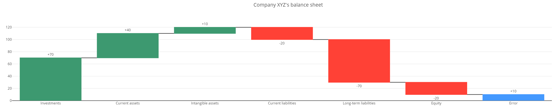
First I organized the accounts by type (Assets, Liabilities and Equity) and I sorted it in decreasing order by value, so that it looks a bit like a parabola. Last but not least, the last bar shows if there is error in the balance sheet, since Assets + Liabilities + Equity should be equal to zero.
Conclusion
These are just some examples to illustrate how to use some visualizations in unusual ways to gain insight into a company’s financial statements. I think we shouldn’t underestimate the importance of the right data visualization when conveying information and trying to gain new insights into a company’s financial situation.